Beautiful design is popular advice for landing pages. It's also one of the least reliable starting points. A polished page can still waste paid traffic when the headline breaks the ad's promise, the form asks for unnecessary information, the mobile experience stalls, or the page is impossible to use with a keyboard.
Effective landing pages are conversion systems, not decorative web pages. They connect audience, acquisition source, offer, proof, action, accessibility, speed, measurement, and revenue in one controlled path. The practical question isn't whether the page looks impressive. It's whether the right visitor understands the offer quickly, trusts it enough to continue, and completes an action the business can monetize.
Table of Contents
- Setting Realistic Conversion Benchmarks
- Engineering Message Match and Frictionless Forms
- Designing for Mobile Speed and Accessibility
- Optimizing for AI Search and Zero-Click Intent
- Running Statistically Reliable A/B Tests
- Meeting Paid Traffic Policies and Quality Standards
Setting Realistic Conversion Benchmarks
Marketers often redesign pages because a conversion rate feels disappointing in isolation. That creates two problems. A team can discard a profitable page because it compares poorly with an unrelated industry, or celebrate a high submission rate that produces weak leads. Neither decision starts with the business model.
A benchmark analysis associated with the Unbounce Conversion Benchmark Report covered approximately 41,000 landing pages, 464 million visitors, and 57 million conversions. The reported cross-industry median was 6.6%, but category medians differed sharply. Entertainment and events reached about 12.3%, financial services about 8.3% to 8.4%, professional services about 6.1%, ecommerce about 4.2%, and SaaS about 3.8%.
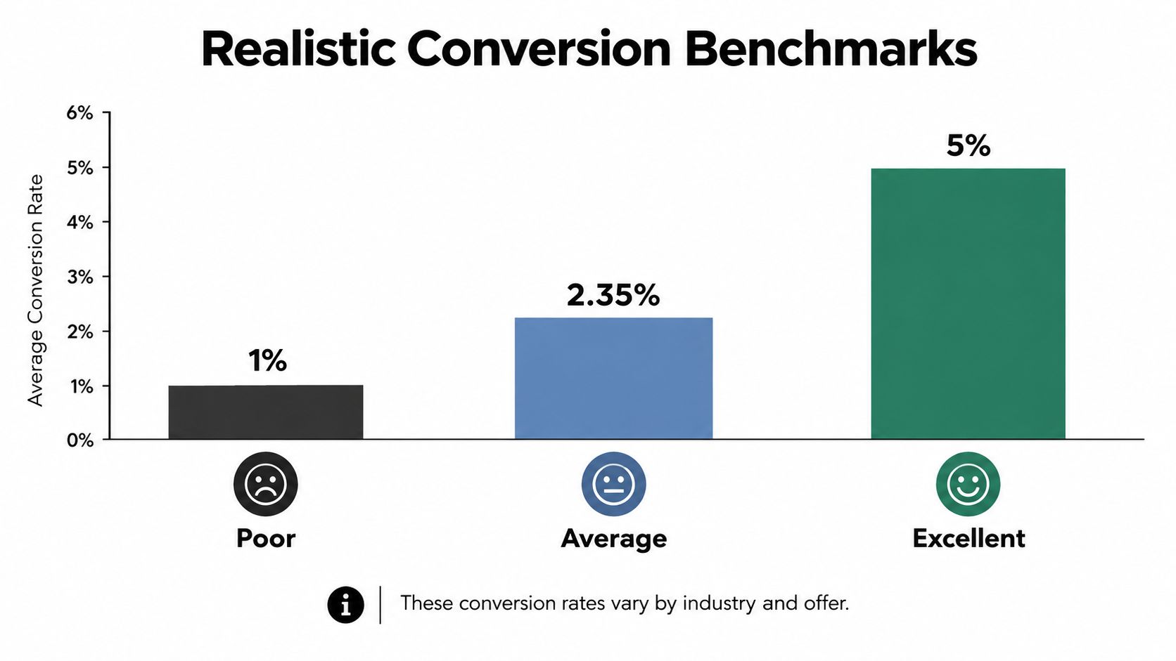
Those numbers are directional, not promises. Traffic intent, device mix, offer strength, conversion definition, and acquisition channel all change the result. A SaaS page converting at 4% can be competitive against its category, while an events page at the same rate may signal a serious problem. The page's contribution to qualified pipeline or revenue matters more than an attractive percentage in an analytics dashboard.
Set the objective before writing copy
A landing page should have one audience, one promise, and one primary action. That action might be requesting a demo, starting a trial, downloading a guide, booking a consultation, or purchasing an offer. Each choice changes the amount of explanation, proof, qualification, and risk reduction the visitor needs.
A generic homepage usually serves too many audiences at once. A paid search visitor looking for payroll software shouldn't have to interpret a broad corporate message, move through several product categories, and decide which button applies. A dedicated page can mirror the campaign's intent and remove unrelated exits.
Practical rule: Define the conversion event in business terms before selecting a design. “Form submitted” is a useful event, but “qualified opportunity created” or “revenue generated” is a better decision metric.
The benchmark should become a starting baseline, not a target copied blindly. Record sessions by source and device, CTA clicks, form starts, form completions, qualified leads, and downstream revenue. Teams can also use a framework for sales KPIs to connect landing-page activity with the commercial outcome that leadership actually cares about.
Measure quality, not just volume
A short form can generate more submissions while lowering sales efficiency. A longer form may reduce raw conversion volume but improve qualification. Neither is automatically correct. The right design depends on the immediate decision the visitor is ready to make and the amount of information sales needs at that point.
A useful baseline separates visitors by industry, source, device, offer, and intent. A paid brand-search page shouldn't be judged against cold social traffic, and a demo request shouldn't be compared with a low-commitment content download. Good landing-page creation starts by making those comparisons fair.
Engineering Message Match and Frictionless Forms
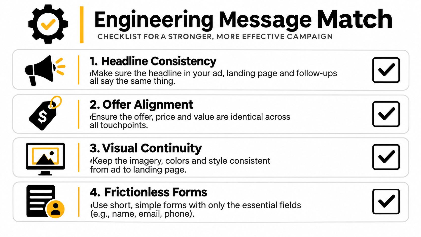
A visitor clicks because an ad, email, or social post makes a promise. The landing page has one job at the opening: confirm that the visitor arrived in the right place. If the ad says “Book a SaaS pricing consultation,” a headline such as “Transform Your Business Today” creates work before the visitor can understand the offer.
Message match means carrying the same problem, audience, offer, and next step from the acquisition asset into the page. The words don't need to be identical, but the meaning should be unmistakably continuous.
Map the promise across the page
Use a simple message map before drafting:
- Ad or email: Identify the exact promise, intent, and emotional trigger that earned the click.
- Headline: Restate the promised outcome in language the visitor recognizes.
- Subheadline: Clarify who the offer serves, what it includes, and what happens next.
- Proof: Select evidence that addresses the visitor's likely concern, not a random logo wall.
- CTA: Describe the immediate action and its value, such as “Request a demo.”
- Confirmation: Tell the visitor what happens after submission and when they'll hear from the business.
Keep one primary CTA above the fold. A longer page can repeat that same action after important proof or objection handling, but competing buttons create decision noise. Supporting copy should remain scannable, with short paragraphs, descriptive subheads, useful bullets, and specific benefit language.
Forms deserve the same discipline as headlines. Baymard reports that the average checkout contains 11.3 form fields, and 22% of users have abandoned checkout because of complexity, according to its checkout research. Although checkout behavior isn't identical to lead generation, the lesson transfers well: ask only for information required for the immediate qualification decision.
Reduce questions without destroying qualification
A business selling an enterprise product may need a work email and company name to route a lead. It may not need a phone number, job title, company size, budget, use case, and implementation timeline before the visitor has received any value. Optional questions can move into a later qualification step, a progressive form, or a sales conversation.
Baymard also reports that 14% of users abandon checkout when a phone number is requested unless the site explains why it's needed. If a phone number is necessary for a scheduled call, say so beside the field. Visible labels, appropriate mobile input types, inline validation, clear recovery instructions, and concise consent language remove avoidable frustration.
A practical form should:
- Use visible labels: Don't make placeholder text carry the meaning of a field.
- Explain unusual requirements: Tell visitors why a phone number or company detail is necessary.
- Validate inline: Identify errors near the field and preserve focus so recovery is immediate.
- Set expectations: State what happens after submission, including response timing without inventing a guarantee.
- Protect consent: Make privacy and marketing permissions understandable rather than burying them in dense legal copy.
Teams that need a deeper treatment of form mechanics can use this resource on improving form completion rates. The principle remains simple: every field should earn its place by improving the next business decision.
A visual walkthrough can reinforce the relationship between offer structure and action placement.
For teams building pages without stitching together separate design and tracking systems, The AI CMO's landing-page builder is one option. It can create a page from a plain-language description, include sections such as proof, offer, FAQ, lead form, and CTA, and publish to a live URL or export a single HTML file with tracking and consent settings.
Designing for Mobile Speed and Accessibility
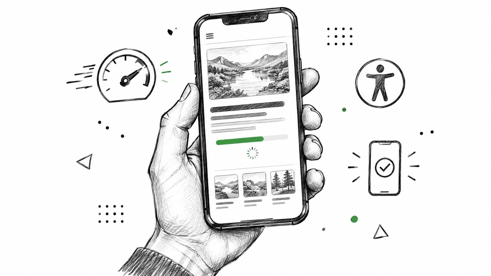
Desktop-first landing-page design fails because the visitor doesn't experience the desktop layout first. A mobile visitor sees the hero image load slowly, the form collapse awkwardly, the CTA move below the fold, or a validation error that disappears when the keyboard opens. That experience can destroy intent before the copy gets a chance to persuade.
Reported benchmark data found that mobile represented 83% of visits, while desktop pages converted 8% better, indicating a potentially material experience gap. The mobile landing-page analysis supports a clear operating priority: design and QA on mobile conditions, not just desktop screens.
Remove technical friction before persuasion work
A fast page doesn't require a dull page. It requires deliberate asset and script decisions.
- Resize and compress images: Serve images at the dimensions the layout needs rather than shipping oversized originals.
- Remove unnecessary scripts: Third-party chat, tracking, animation, and personalization tools should justify their effect on the conversion path.
- Reserve layout space: Stable containers prevent text and buttons from shifting as media loads.
- Prioritize critical assets: Load the content required for the first decision before secondary decoration.
- Test realistic conditions: Use mid-tier mobile devices and slower networks, not only a high-end office laptop.
The form should use a responsive single-column layout, large tap targets, autofill-compatible fields, and error messages that explain recovery. A persistent CTA can help on a long mobile page, but it should remain unobtrusive and never cover the form or essential content.
Treat accessibility as conversion engineering
Accessibility problems interrupt actions. Low contrast makes text harder to read, missing labels make fields difficult to interpret with assistive technology, and poor focus states make keyboard navigation unpredictable. These issues also affect people using a phone in bright light, older visitors, and anyone completing a form while distracted.
WebAIM's 2025 audit found detectable WCAG failures on 94.8% of the top one million homepages, with low-contrast text affecting 79.1% of pages, as summarized in Figma's web design statistics resource. The figures describe homepages, not every landing page, but they show how common basic usability failures remain.
Before launch, check the conversion path with:
- Programmatic labels: Give every field one clear label that assistive technology can read.
- Keyboard navigation: Move through the page and form without a mouse.
- Focus preservation: Return focus to the invalid field after submission errors.
- Contrast and zoom: Test readability at realistic zoom levels and on bright screens.
- Text alternatives: Provide text alternatives for essential visual claims, charts, and product information.
- Target size: Make the complete CTA target usable, not just the text inside the button.
Accessibility isn't a separate polish pass. It's a direct test of whether people can understand and complete the conversion event.
Optimizing for AI Search and Zero-Click Intent
Traditional SEO often treats the landing page as the destination after a searcher clicks a blue link. AI-generated search results complicate that model by answering more questions before the visit happens. A page that only hides its useful explanation behind a form may lose visibility and fail to build enough trust for a qualified visitor to seek the brand directly.
A 2025 analysis of 25.1 million organic impressions reported that average organic click-through rate fell from 1.76% to 0.61% for queries displaying Google AI Overviews, according to PushLeads' analysis of AI search. Other 2025 studies summarized by Originality.ai found that click-through rates declined by nearly one-third when an AI Overview appeared. These findings don't make landing pages obsolete. They change the job.
Give the page two useful jobs
The page should offer a concise, extractable answer for search systems and a compelling conversion path for visitors who arrive. That requires more substance than repeating a keyword in a hero headline.
A strong structure places a direct answer near the top, then explains the offer and evidence in plain language. Descriptive headings help both scanning visitors and retrieval systems understand the page. FAQ-style questions can address practical objections, while original data, methodology, product constraints, and clear definitions make the content more trustworthy than generic summaries.
The page should make four things easy to identify:
- Who it serves: Name the audience and situation precisely.
- What it solves: State the problem and expected outcome without inflated promises.
- Why it's credible: Show relevant proof, process, methodology, or customer evidence.
- What happens next: Make the post-click or post-submit value clear.
A zero-click strategy also requires different measurement. Organic CTR still matters, but it shouldn't stand alone. Track assisted conversions, branded searches, direct traffic, qualified sessions, and post-view conversions where the analytics setup supports those signals.
External references can support credibility, but directory placement only helps when it accurately represents the business and offer. Teams evaluating trust signals through directories should treat those listings as supporting evidence, not a substitute for first-party proof on the page.
The page must answer enough of the question to earn trust, then offer a next step that's more valuable than the answer alone.
That next step might be a calculator, benchmark, assessment, template, demo, or consultation. A visitor who arrives after an AI-generated answer needs a reason to continue, not another vague claim that the company is innovative.
Running Statistically Reliable A/B Tests
A landing-page test is not a design referendum. It's a controlled attempt to learn whether one change improves a defined outcome for a defined audience. Teams get into trouble when they stop after a few conversions, change several variables at once, or select a winner because the variant looks cleaner.
A 2025 survey cited in search results reported that only 32% of marketers who run A/B tests apply them to landing pages, compared with 60% testing websites overall, 57% testing email, and 41% testing paid social, as summarized in CartFlows' landing-page statistics. Other benchmark summaries cited by the same source report that roughly 1 in 8 landing-page A/B tests produces a statistically significant winner. Many tests are inconclusive, which is a reason to improve test design, not to rely on opinion.
Build the test before building the variant
Start with one hypothesis. For example: “Reducing the form to the fields needed for initial routing will increase completed submissions without lowering qualified-lead rate.” The hypothesis identifies the change, the expected direction, the primary metric, and the guardrail.
The test plan should record:
- Primary conversion: Choose one action, such as completed demo requests.
- Guardrail metrics: Monitor qualified leads, sales acceptance, revenue, speed, and error rates.
- Audience definition: Keep the visitor segment consistent.
- Traffic source: Don't combine materially different intent levels without accounting for them.
- Major variable: Change one meaningful element, such as headline, offer, form length, CTA wording, proof placement, hero media, or page speed.
- Decision rule: Define the reliability and practical improvement required before launch.
The page should retain the same offer, audience, traffic mix, and measurement implementation throughout the comparison. Otherwise, the test may report a channel or audience difference instead of a page effect.
The mandatory flowchart captures the discipline required:
Read results like an operator
A visually appealing variant isn't automatically a winner. A statistically reliable improvement that damages lead quality is not a win either. Teams should segment results by device and source, inspect implementation errors, and continue long enough to avoid declaring success from a short fluctuation.
A failed test still creates value when the hypothesis, audience, tracking, and execution were sound. It narrows the decision space and prevents the organization from repeating an attractive but ineffective idea.
For ecommerce teams, a practical A/B testing guide for Shopify stores can add useful context around product and checkout experiments. For broader conversion programs, teams can connect this process with conversion-rate improvement methods, provided each change remains tied to a measurable business outcome.
Meeting Paid Traffic Policies and Quality Standards
A landing page can have persuasive copy and still fail commercially if Google Ads rejects the destination, lowers its quality evaluation, or sends visitors into a broken experience. Paid traffic makes technical quality part of acquisition economics. Every click has already cost something, so the destination must deliver the promise immediately.
For Google Ads, the page and the ad's display URL must use the same domain. Google also evaluates landing-page experience as an input to keyword Quality Score, including whether the page is useful, relevant, easy to move through, appropriately linked, and consistent with the clicked advertisement, as explained in Google Ads' landing-page guidance.
Treat the ad and page as one asset
Suppose a search ad promises a product demo for marketing directors. Sending that click to a general homepage forces the visitor to find the product, interpret the navigation, and locate the demo path. A dedicated page with the matching service, audience, proof, and CTA removes those decisions.
Before launch, confirm:
- Domain consistency: The destination and display URL belong to the same domain.
- Immediate relevance: The promised content appears without requiring unrelated navigation.
- Functional behavior: Forms, buttons, tracking, consent, and confirmation states work.
- Browser coverage: The page operates on commonly used browsers and devices.
- Exit clarity: Visitors can leave without being trapped by obstructive elements.
- Content honesty: Claims, pricing context, eligibility, and offer limitations aren't misleading.
- Load quality: Heavy media and scripts don't prevent the page from becoming usable.
Google Ads destination policy requires an advertising landing page to be functional, useful, safe, and easy to use. Pages may violate policy when they're difficult to leave, misleading, slow on commonly used browsers or devices, or dependent on an additional application to display their content, according to Google's destination requirements.
A compliance review should happen before campaigns go live, not after spend begins. Test the full journey from ad click through confirmation, including consent behavior, mobile keyboard interaction, validation errors, and the handoff to sales or fulfillment. The strongest page is still a liability if the platform can't crawl it, the visitor can't use it, or the business can't follow up on the conversion.
The AI CMO offers a marketing operating system with a page builder that can create landing pages from plain-language descriptions, publish them to a live URL or export HTML, and include forms, tracking, and consent settings. That kind of workflow can help teams keep page production and measurement closer together, while approvals and policy checks remain part of the operating process.
Marketing teams can turn these principles into an operating system with The AI CMO. It combines landing-page creation, campaign execution, first-party customer data, experiments, and revenue measurement so teams can build pages, approve changes, and learn from qualified outcomes rather than vanity metrics.
Share this article